Branding
A new and dynamic brand identity
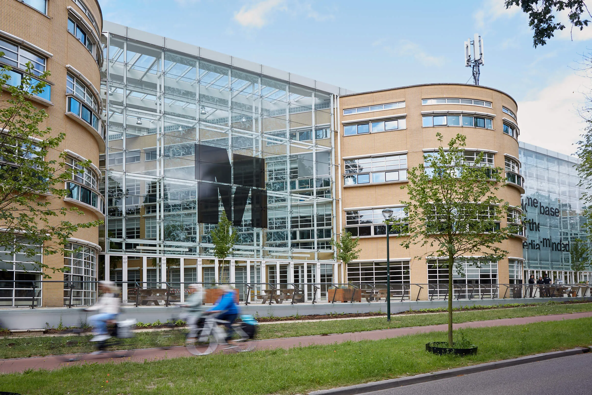
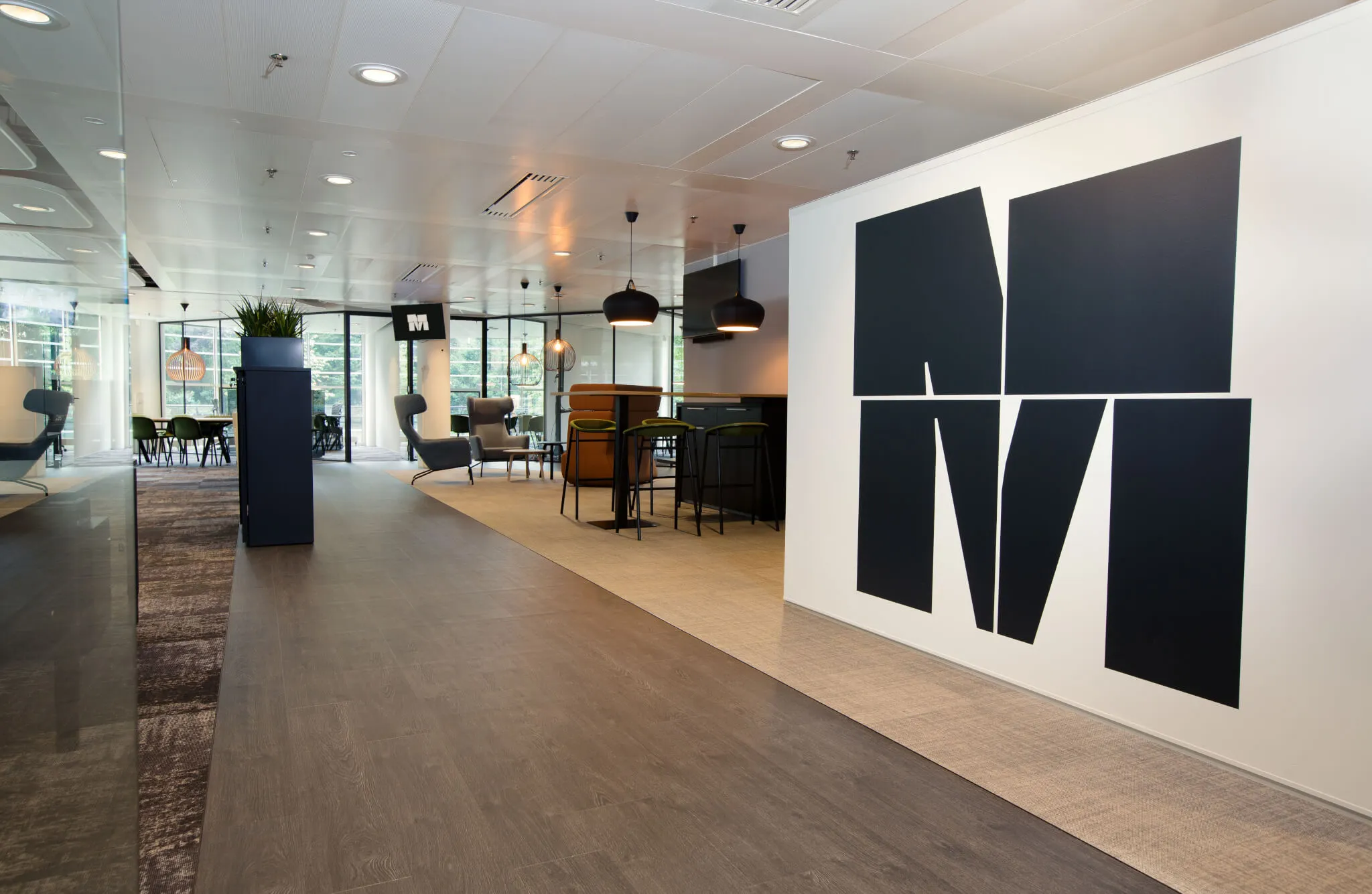
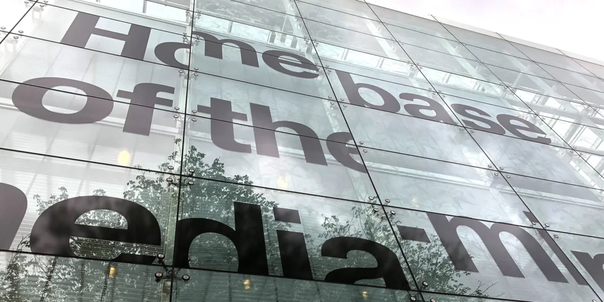
We were asked to create the brand identity for the building of the AKN foundation. The building is now called 'M' and carries the pay-off 'Homebase of the media-minded'. This outspoken brand identity underlines the media character of the building, bringing together its broadcasting history with the dynamics of new media.
The idea
We were asked to create a dynamic brand that can grow and evolve with the fast moving media landscape. After the 2013 government cutbacks, the AKN building was 45% empty, only 900 productive hours were made in the studio and the building and the AKN Foundation suffered from a negative image. In 2014 the board of the AKN Foundation, formed by the directors from AVROTROS and KRO-NCRV, asked Michiel Leijenaar to draw up a Master Plan. This resulted in the building being completely transformed into an attractive and high-profile media hotspot: M, homebase of the media-minded.
Canvas for media makers
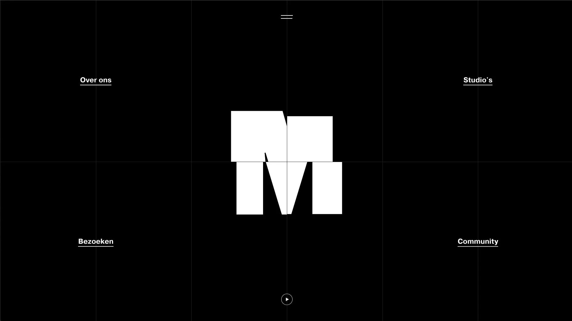
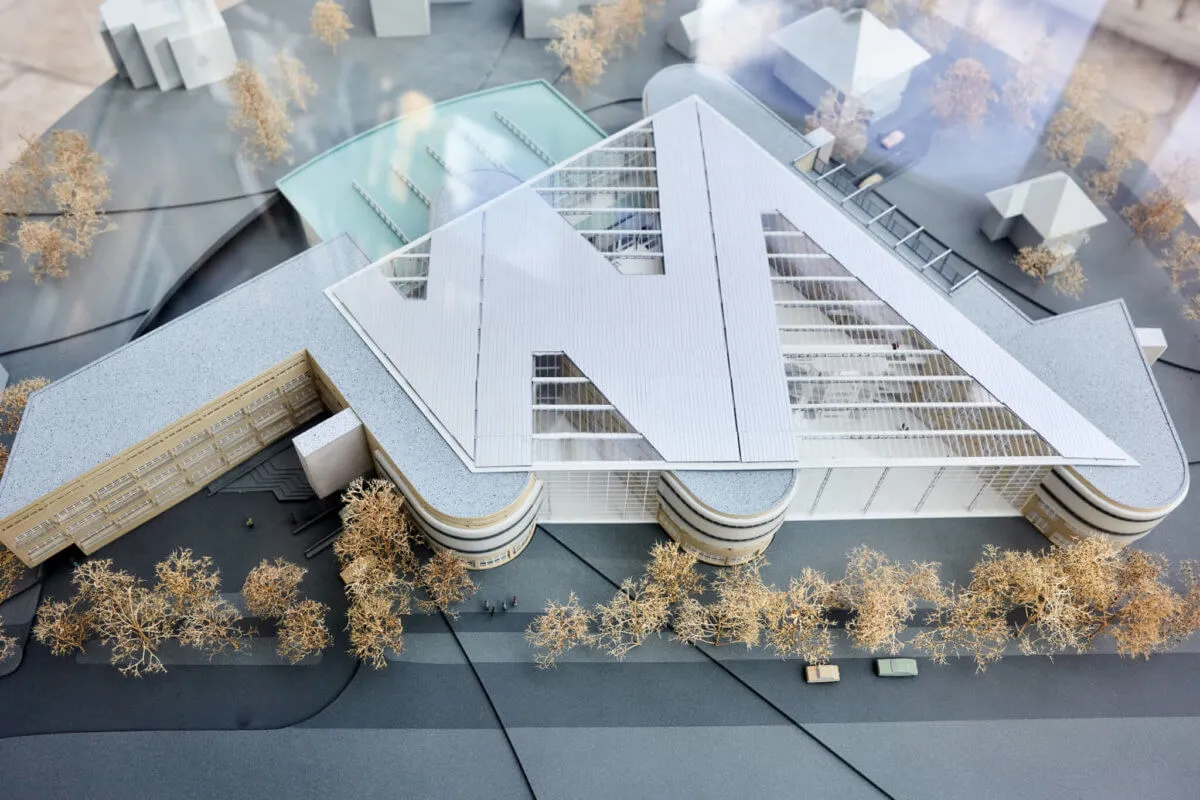
The name M is inspired by the design of the building – there is a large M-shaped sound wave on the roof – and the connecting factor: media. This way, the media building tells its story with one powerful letter. The pulsating M represents the beating heart of the media world and is designed to move with the rapidly changing media landscape.
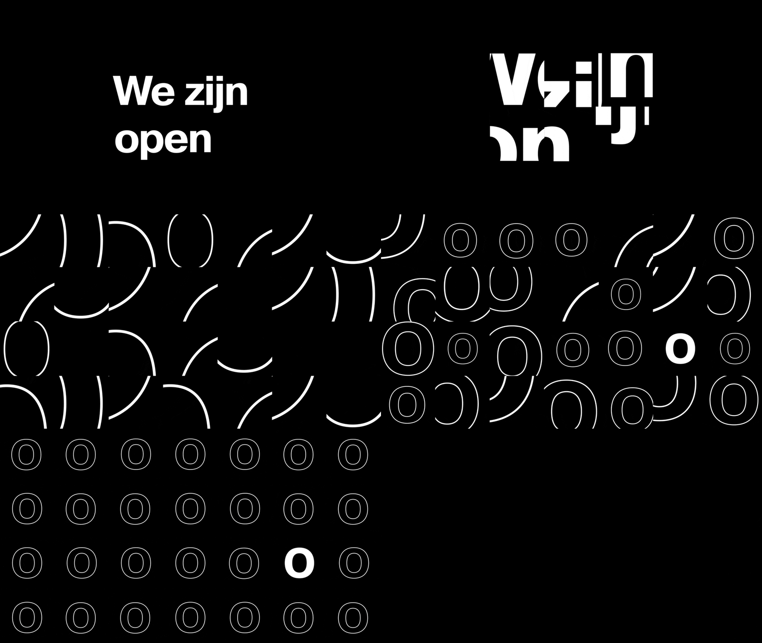
We developed a design grid based on the iconic windows of the building. We see the large windows as a canvas for media makers, to which everyone can give their own interpretation. This way everyone is represented in the M brand identity, and an ever-changing mix of content is created. We give the content all the attention by only using black and white in the style.

Implementing the new style
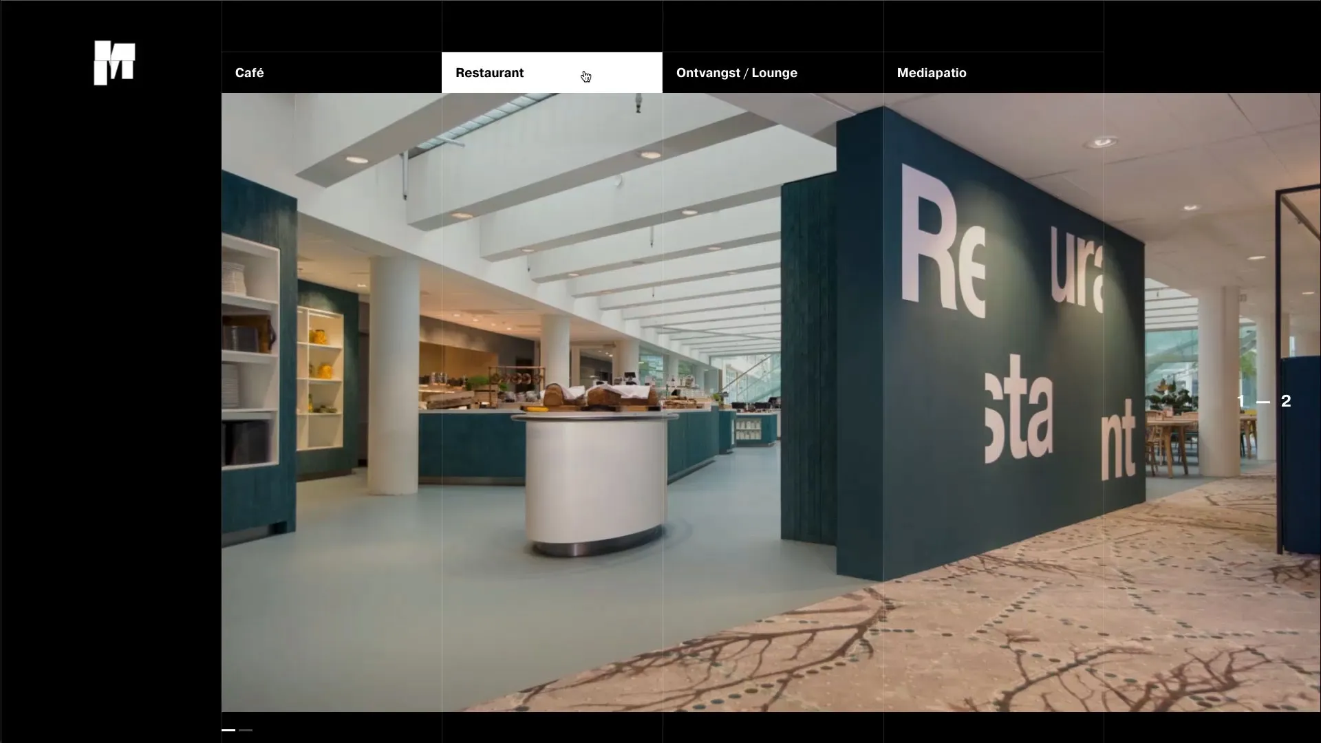
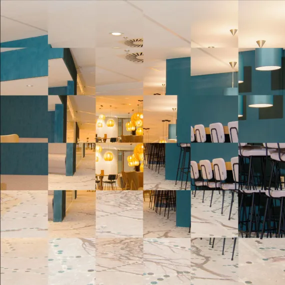
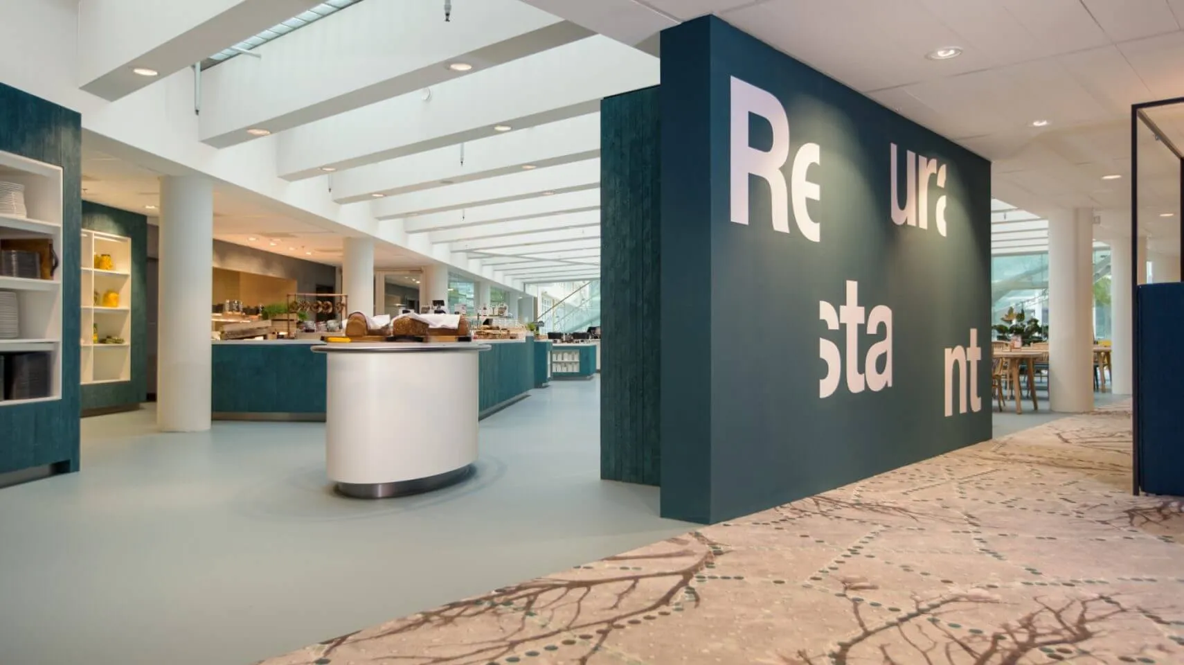
In addition to the branding, the building was thoroughly renovated inside and out and equipped with state-of-the-art studios, meeting rooms, offices and catering facilities. The new style can be found throughout the building, from the entrance hall to the café and from the studios to the conservatories.

A strong digital presence
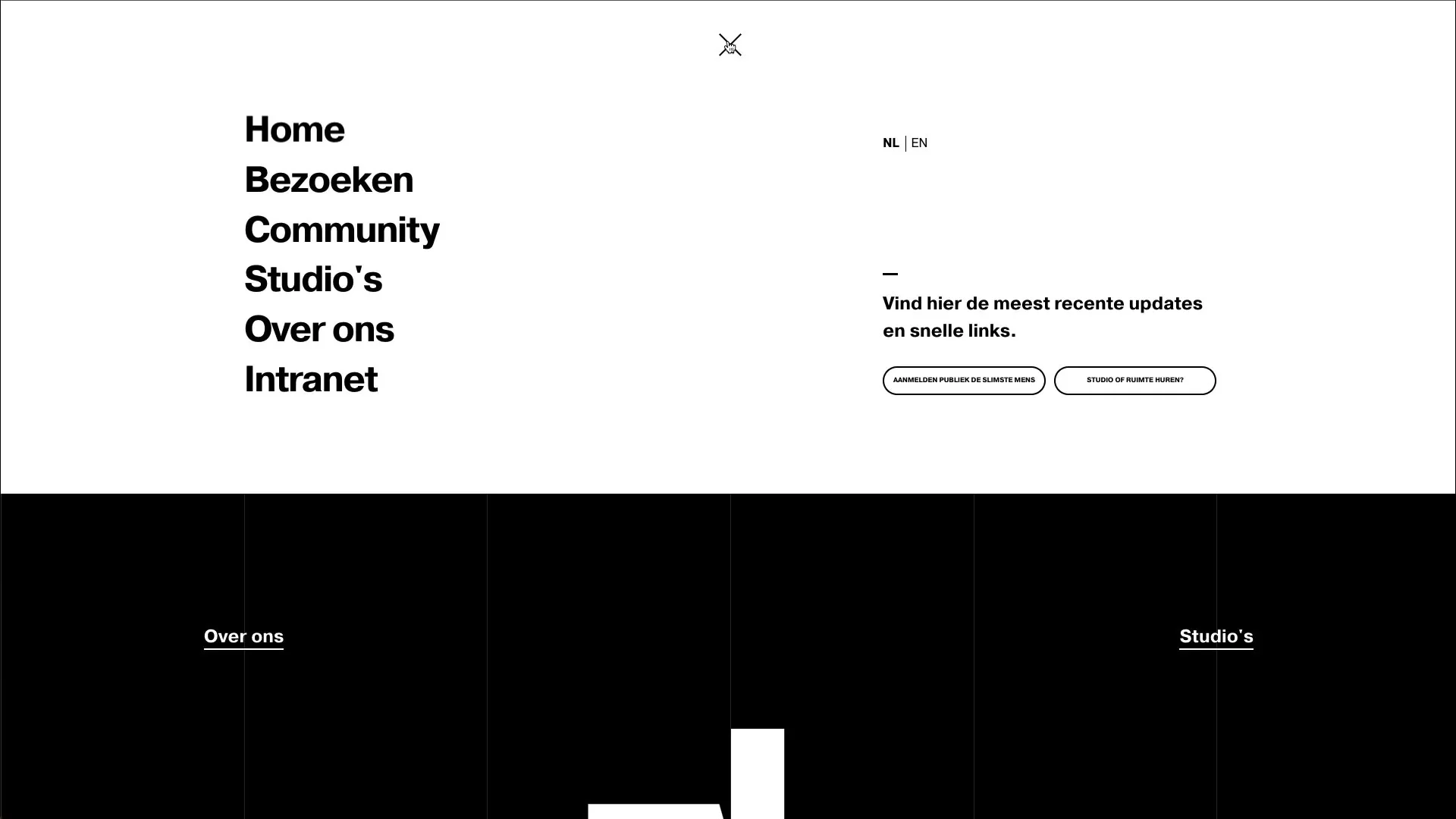
We translated the dynamic new identity into a new digital presence too. The entire website is provided with a grid over which everything is neatly positioned. Some blocks get a background image when the cursor hovers over them. To make things more dynamic, this grid is sometimes broken.
The text of the brand is simple, but effectively designed. Only one white font is used, but different sizes and thicknesses give it a clear structure.
Highlights
Menu interaction
Gallery navigation
The pulsating M represents the beating heart of the media world and is designed to move with the rapidly changing media landscape.
Credits
- Sticking AKN
- Matters Most
- Woodwork
- 51 North
Services
- Art direction
- Brand design
- Environmental
- Wayfinding
- Signing
Awards
Awwwards
- Site of the Day
- Developer awards
- Mobile Excellence
- Honorable Mention

